
5 The Role of Visual Rhetoric in Web Writing
Paul Muhlhauser
Learning Objectives
You are gonna be able to
- apply critical lenses to the visual mode of communication.
- evaluate the efficacy of a text’s use of the visual mode of communication on audiences.
A picture is worth a thousand words…
Yeah. But a word is worth a thousand pictures, too, right? I mean look at “I” and “me” and “you.” Lotsa pictures for those words. You can even have a word of a picture or a picture of a word. Not sure how much those are worth 🙂
The thing to keep in mind about word-picture value in online environments is that writing the web is designing the web with words and pictures. And visual rhetoric is that process for deciding word-picture worth. Depending on the context, audience, and what you’re doing—whether that be persuasive, informative, humorous, or whatever—visual rhetoric can help you be an effective and successful web writer/designer.
Check out how online writing has changed in the University of Maryland’s website:
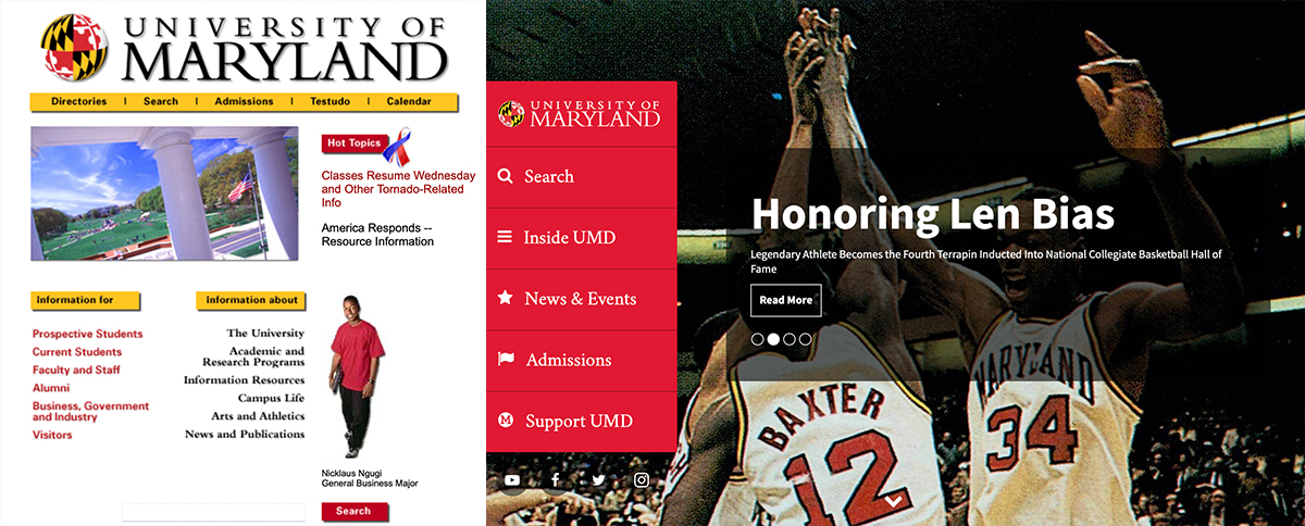
Time change: Less white space. Big pictures.
Besides that, think about all ya do online already: choosing a header for your YouTube channel, creating a profile pic for Instagram, filtering your Snaps, selecting choice pics for Tinder, or deciding on a layout and color scheme for your blog/website. See how popular the “sosh” platforms are for Generation Z and Millennials: “a majority of 18- to 29-year-olds say they use Instagram (71%) or Snapchat (65%)” (Auxier and Anderson). Facebook is up there, too, at 69% of the overall U.S. population (Auxier and Anderson). In other words, being visually savvy and knowing visual rhetoric is pretty important for designing and reading the world. (See “Social Media Use in 2021” for more information about demographics and platforms.)
As far as information goes, you know how dictionaries hold words and make them legit. You know how words are pretty easy to manipulate and put together (i.e., words let you see speaking and hear writing). And with words, it’s always been pretty easy to copy/paste and find/replace—to take what’s there (copy/paste) and make it your own (find/replace). Now, the same is true for pictures. There’re a lotta databases (might as well call them visual dictionaries) of pictures for copy/paste and there are lotsa visual editing programs to find/replace—to write and design pictures how you see fit.
Words and pics don’t work in exactly the same way. I mean, words are often experienced pretty linearly without much visual design. And pictures are seen at once as wholes often with a lotta visual design. However, even though there are differences, there are a lot of similarities in how they communicate: words get picturey with typefaces. Pictures get wordy with typefaces. There are a lot of things that guide how they work in similar ways and how they work together.
Below you’ll find some of those things—communication equipment for thinking about visual rhetoric: A process for understanding the visual mode of communication and its efficacy on audiences, highlighting both implicit and explicit effects. The equipment will help you make writing and design decisions for your online compositions. Consider these tools as you copy/paste and find/replace when determining whether or not your rhetoric is going to be effective.
Visual Habits: To be the apple of someone’s eye…
is a little misleading, especially if that someone hates the taste of apples, is allergic, or had a really bad experience with them (i.e., never use the phrase around Snow White). In more words, that’s a big problem if you don’t know your audience and/or aren’t aware of visual habits. Visual habits are the ways culture has helped someone internalize seeing. It’s the “how” and the “what” you see without thinking too much about it. You might call it, “Interpretations Automatic.”
Check out this picture→

Bet you didn’t read it as cannibalism at first!
But it could be:)
You can even get feelings from visualized words. I mean which college would you rather go to?
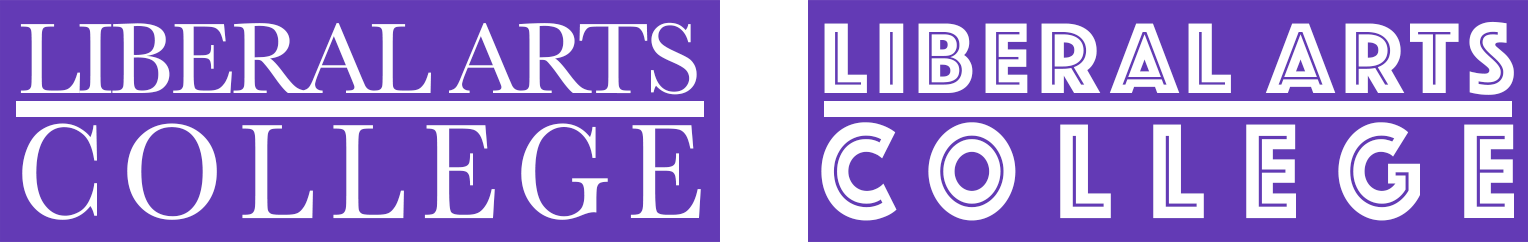
I know where I wanna go!
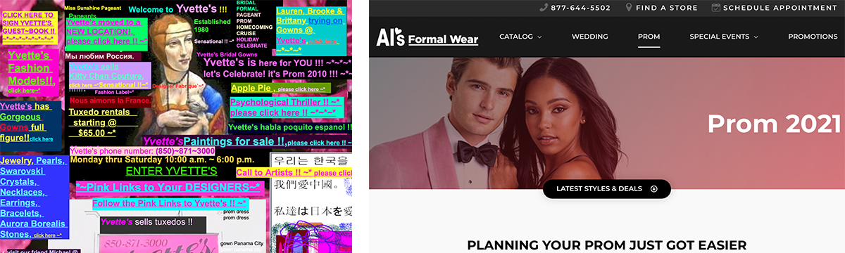
And what counts as good layout or design? This or this?
Understanding visual habits is important because it helps you, as an author, be more aware of your writing and design decisions. For an audience it helps you think a little differently about authorial decisions and why you “see” something as normal, when it certainly doesn’t have to be. Once you start looking at visual habits, you can start applying critical lenses to all you see. Critical lenses take out the automatic in “Interpretation Automatic” of visual habits.
Critical Lenses: Through rose-colored glasses…
is one optimistic way to put it. Of course seeing through rose-colored glasses might make it easy to miss a stop sign and cause a gigantic, helicopter reporting, news story car crash. The thing is is that this “speaks” to lenses—to what we can adjust when we start to get critical about our visual habits. So the lens is what you focus on critically when you start thinking about pictures. Remember that cannibal picture above? What if we did something a little different and applied a gender lens to it?
Visual habit for a lot of us would say, “That’s natural. Just a mom, nuzzling her baby.” Critical lens, on the other hand, might say, “This shows some assumptions about moms and kids, about women and kids—that moms snuggle and are tender, but dads (men) aren’t.”
And then what if you look at what Google shows when you do a search for “moms and kids” and “dads and kids” (searched using Creative Commons licenses, which you’ll learn more about in the chapter, “Images“). Here are the first pics you see:

Again, visual habits might say these are natural. But if we look through critical lenses, we see that Dad gets to play with the kids and teach them about dandelions. Mom’s nuzzling and being tender. I know my parents were more dynamic than that!
Of course, you can and should use many lenses so you can get a better idea about what you’re representing and making sure it is communicating your purpose effectively. I mean you can use any number of social and economic categories for lenses (i.e., sexuality, race, class, disability, etc.). You can even add environmental lenses (How is the environment shown? Is this how I want to represent it?). You could apply layout and visual design lenses to make sense of how a website is easy or difficult to navigate (see the chapter “Visual Design Basics” for more on this lens). Seriously, there are infinite numbers of lenses that can help you in making decisions for your pictures and words. Like how does a kid lens guide how you see this? As a kid with some nasal blockages that a finger needs to excavate, which toy store would you feel you could “pick it and flick it” without having security escort you to a timeout?

In other words, change lenses. Apply a lot of them to get a better idea about all that’s happening in online visual rhetoric.
Applying lenses isn’t easy. It takes practice and an understanding about how to be conscious about looking and seeing past and through visual habits.
Contextual Frames: What you see is what you get…
Doesn’t always work out. I mean considering visual habits and the critical lenses, there is a lotta interpretation going on when one is writing and designing. So what I see might be what you saw but what I saw might actually be not what you see. Check this out. I mean what is happening?

This picture could mean something different depending on the “word” context! What’d you see? What’d I see? Here’re how words can help: “Moose Love Cars” or “Moose Hate Cars” or “Moose Attack” or “Moose Lick” or “Gimme a Ride.” Words guide the pictures and pictures guide the words. They help each other shape the context.
So contextual frames are all that surrounds your visual designs: the words, pics, layouts, colors, content, composition, and even audience!
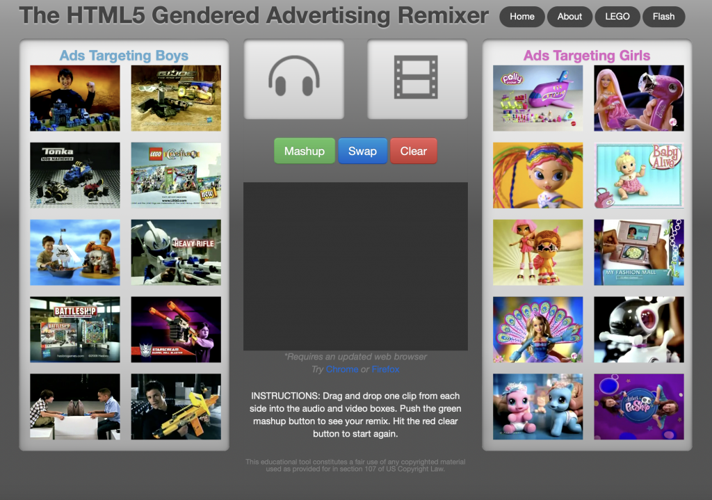
And depending on your purpose, you might want to be disruptive of visual habits. See this Gender Toy Remixer for a little more about copy/paste and find/replace. See how the frames are disrupting the visual habits one might have and moving you into critical lenses? Go ahead and play! Remix!
The key to contextual frames is to think about the context of your visuals, how they work with other visuals, how they work with words, and thinking about how your words connect and disconnect with audience’s visual habits and what you want to communicate to them.
Envisioning Equity: See eye to eye…
is pretty impossible. I mean unless I hold an “I” up to my “eye”—then it just might work, because I mean no one is that alike. Maybe we agree kinda. Point is there is a lot “more than meets the eye” when it comes to considering visual rhetoric in online environments. In other words, it’s important think about how fair you are being to audience members who experience visual design differently in online environments. Two things to keep in mind are technical access considerations and habitual access considerations.
Considering Technical Access
The gist of this form of access is to consider how users with different abilities and different devices can successfully experience your visual designs.
- Access to information: This type of access is for making sure people with different abilities have access to your visual imagery and can move through your layout (if you wrote and designed a website). For instance, have you designed information that is accessible to color-blind users? Does your imagery come with alt-text? For people with a visual disability, having alt-text allows screen readers to describe the imagery to them and let them know it’s there and what’s up. That’s just one part of it though. See the chapter, “Usability,” for more information. And see Web Accessibility in Mind (WebAIM) for more details on designing accessibility.
- Access to devices: This type of access is for making sure people using different devices, operating systems, and a variety of internet speeds have access to your work and can experience your words and pics. See the chapter on “User Experience” for more information about how to do this.
Considering Access to Visual Habits
This sort of access is a kind of demographic access, asking you to consider more carefully who you are showing, what you are showing them to do, and how they are doing it. It asks you to consider carefully representation practices, utilizing critical lenses to make decisions about what you picture and how you picture it
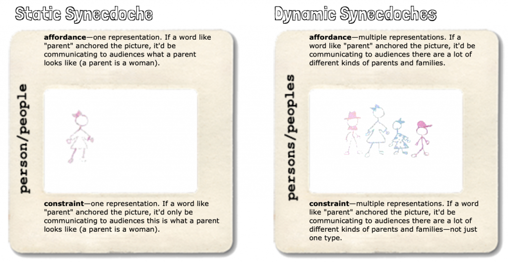
- Affordances for access: This type of access considers how a technology affords access in its design. For instance, inserting a static picture on a website can be considered equity limiting. After all, only one picture gets to be featured. Slideshows and videos offer equitable solutions for upping representation. Just make sure when using these tools, you practice “Access to information” mentioned above.
- Representational access: This type of access is for considering who and what you picture and how they are presented in the picture. If say, you are designing a restaurant website, will the pictures only show white people? Will the only white people smiling be women and play into stereotypes about women needing to be shown in ecstasy in advertising? (Seriously, I’ve seen this happen and this satire on making the J.Crew catalog discusses it—”How Genders Work: Producing the J.Crew Catalog.”). Or will your site consider more carefully who is shown doing what and how they are doing it, including POC? To learn more about pictures and representation, check out this website:
“Seeing” Good-bye: Hindsight is 20/20…
and that’s ok. As you write and design the visual you’ll get better at it, and you’ll be disappointed in what you’ve done in the past. However, you’ll find that your thinking about visual rhetoric will become a habit. The equipment—critical lenses, contextual frames, and envisioning equity—will become easier to use with practice and you’ll find your work gets better too. Last thing to keep in mind: Remember, a picture is certainly worth a thousand words but a word is also worth a thousand pictures, too. I mean that seems more equitable and that relationship reflects the role of visual rhetoric in online writing.
Works Cited
Auxier, Brooke and Anderson, Monica. “Social Media Use in 2021.” Pew Research Center, 7 April 2021. Accessed 25 Nov. 2021. https://www.pewresearch.org/internet/2021/04/07/social-media-use-in-2021/
