13 UML and Other Diagrams
When diagrams are used, the diagrams used are typically from a category called “UML diagrams”, with “UML” meaning “Unified Modeling Language”. That doesn’t mean that you can only use UML diagrams. UML is shown because its use is fairly common, and you may be required to use certain UML diagrams by management. The main rule in the use of diagrams, though, is that diagrams should be used to make things clearer, and not to check off some box. If UML will make your document clearer, use it. If some other diagram or image will make your document clearer, use that. If text alone will make your document clear, stick to text alone. Diagrams used in the examples below are used under the Wikimedia License. Each is taken from the Wikipedia section on UML diagrams, and author names shown are Wikipedia user names.
13.1. The UML Class diagram
The Class diagram is used to show hierarchies of any sort. In a requirements document, you might use this to show an enterprise system, the component systems, and subsystems. You would typically not show class-oriented language’s classes, because that’s best left to the designers of the internal system. In this instance, “class” means anything with an “is a” relationship. Here’s an example:
The boxes indicate a categorization or class. The arrows indicate a “child of” or “is a” relationship. The symbology in the lower left is a note or title.
13.2. The UML Activity Diagram
The UML Activity diagram is very close to a standard flowchart. It is used to show the sequence of events, for people, for programs, and for other processes. It includes activity steps and decision-making steps. Here is an example (by Gwaur):
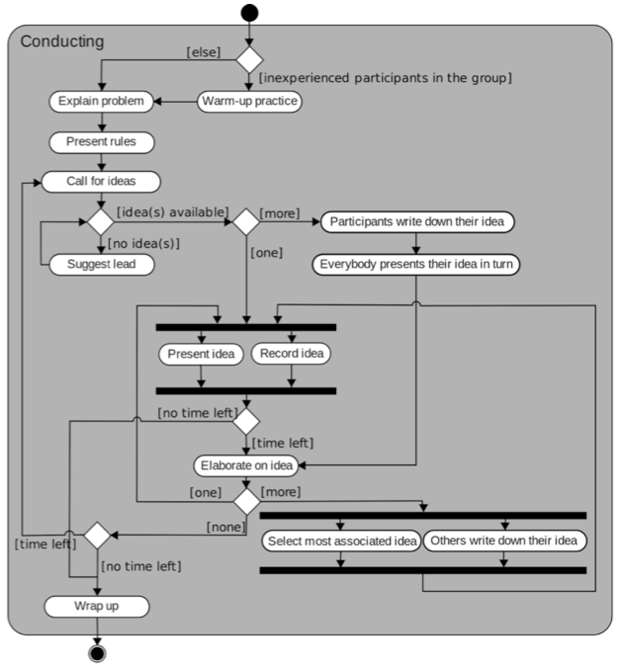
In this symbology, the black circle indicates the start of the activity-set, and the circled black circle indicates the end of the activity-set. Thin lines and arrows indicate what comes next. Note that when lines cross, one of the lines will “hop over” the other. When two lines merge, the lines simply meet, The ovals/rounded rectangles (for lack of a better name) show activities or tasks. The diamonds indicate a decision point. When the flow of work or execution leaves a decision point, each decision is labeled (with brackets) on the outgoing lines. When the flow of work or execution splits into parallel tasks, or joins from parallel tasks back into a single flow of work or execution, there is a wide bar to indicate that.
13.3. The UML Communications Diagram
This type of diagram is used to show communications paths. The image shown below (by Ommler) is a trivial example:
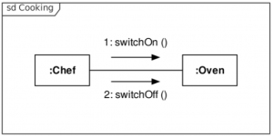
The various items that communicate with each other are shown as boxes, with the items’ names in the boxes. Colons are a part of this, but we’re not sure why. The lines connect the communicating entities, and the arrow-and-message pair show the direction of communication and the message. These could involve message names, IDs, and/or the methods called to invoke the message. This example shows IDs and methods calls. The item in the corner is the title.
13.4. The UML Interaction Diagram
The UML Interaction diagram shows interactions between (typically) the users, the system, and possibly peripheral devices. It is also much like a flowchart. A set of UML diagrams should use flowcharts, Interaction diagrams, or Activity diagrams, or no diagrams of this nature, but these should not generally be mixed. Here is an example of an Interaction diagram (by Stkl):
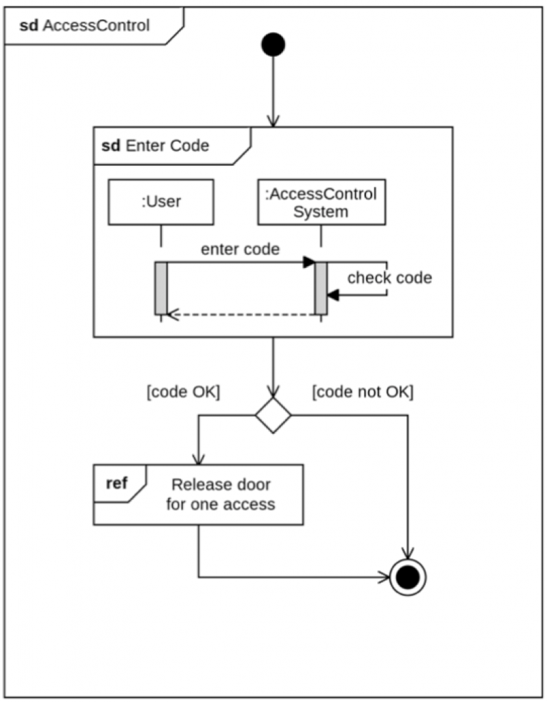
Much of this chart is as explained above for the activity chart. Note that this one also has titles and sub-titles, This type of diagram intermixes flow with timing (seen below).
Sheldon’s recommendation is to stay away from this type of diagram.
13.5. The UML Sequence Diagram
The UML Sequence diagram is useful to show complex timing requirements, and often involves around three communicating entities. Simple timing requirements generally don’t need any sort of diagram. This sample shows two entities:
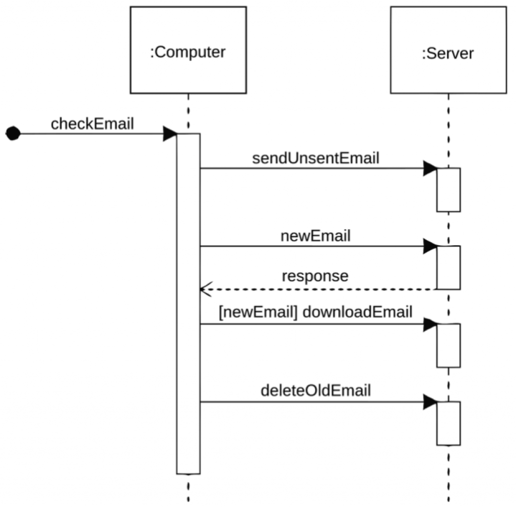
This is actually one of the more important forms of diagram, and is used when the interaction timing or message timing is very important. The boxes at the top are the process, system, or function names (again with colons). The dotted lines are just to keep things easy to relate to the function. The black dot indicates the trigger or initiation or start of the transaction set. The vertical rectangles indicate processing time, with time passing top to bottom. The arrows and the names over them indicate calls or messages. Sometimes a dotted arrow is used to indicate a response, and sometimes to indicate an optional message.
13.6. The UML Use Case Diagram
The UML Use Case diagram is commonly used to show how functions fit together. The diagram (by Kishorekumar) shown here is a bit more complicated than you’ll usually see, but it shows all the components that can appear:
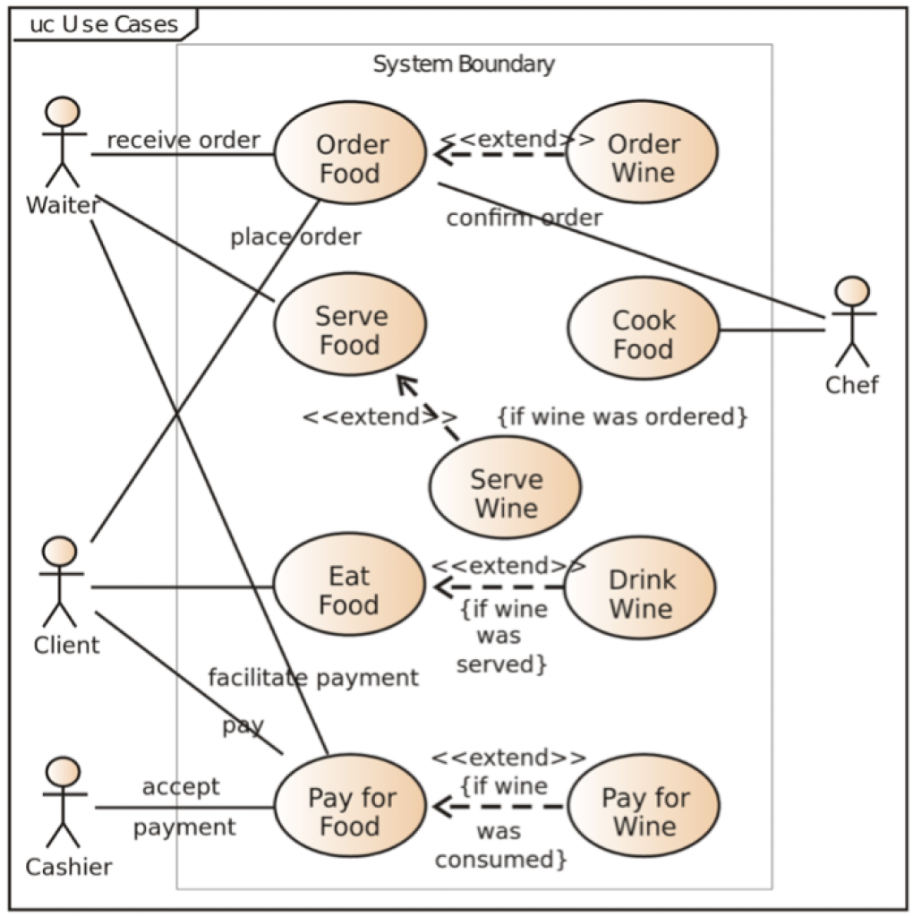
Shading or coloring is not required. The symbols shown here as “<<” and “>>” are usually shown as “«” and “»”. If you’re on a Mac, those are typed as Option-\ and Option-|, respectively. If you’re on a PC, hold down ALT, then type 171 or 187, respectively, on the numeric keypad, and then release the ALT key.
The actors are depicted by stick-figure people, with names. The system under consideration is not usually depicted as an actor, but if it (or some other system) needs to be, then an addition, “«System»” will appear. Functions or functional areas will appear as labeled ovals, and lines will connect actors to functions, when the actors and the functions interact, and functions to functions when they interact with each other. For instance, In sending an eMail, the Sender actor would connect to the Send function, which would connect to the Receive function, which would connect to the Receiver actor. When one function extends or includes another, a dashed arrow and “«Extend»” or “«Include»” appears. When there is more than one system involved (or optionally always), a faint rectangle appears around the functions of each system, grouping them, with a label indicating which system. Also appearing in the corner of this sample is a note or title.
13.7. IDEF1X Data Relationship Diagram
The most common form of visually documenting data structures is the following format:
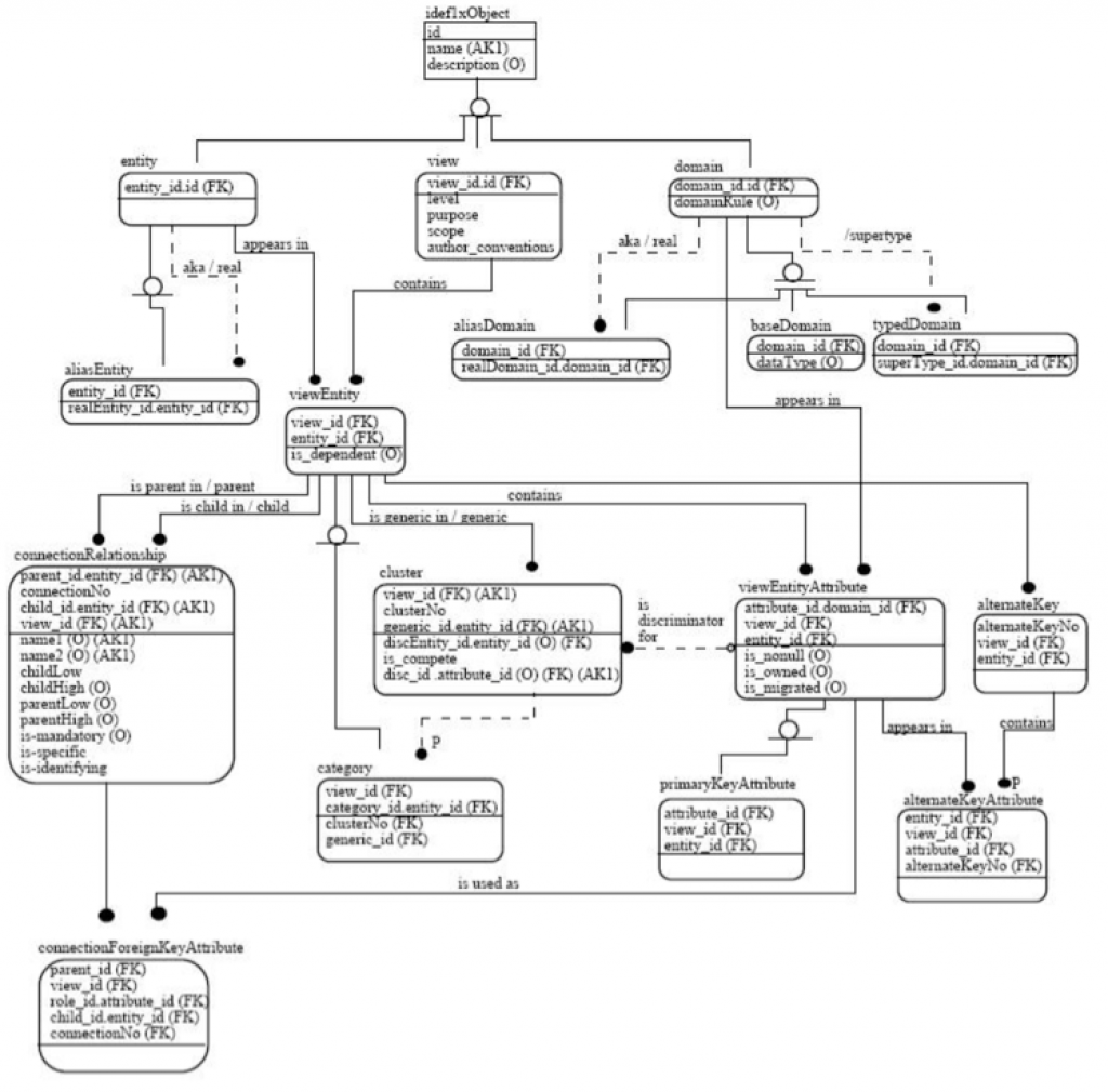
You should probably not need to draw any diagrams of this nature to do requirements, but you may need to be able to read it, especially for Gap analysis purposes. Generally, each rectangle or rounded rectangle will indicate a table. With that, there is a line, and over the line is the primary key of the table. Below the line are the other data. “FK” means Foreign Key, which references the primary key of another table (or in rare cases, back into the same table). The lines show how those records (usually using FKs) connect. Often, this will be combined with “crow’s foot” notation, in which a line or “1” crossing the line means that there is exactly one connection at this end of the line, a circle or “0” crossing the line means that there may be one connection at this end of the line, and a crow’s foot or “>” or “<” crossing the line means that there may be any number of connections at this end of the line.
13.8. Other UML Diagrams
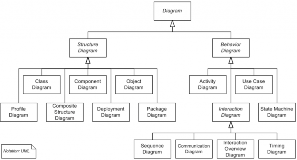
There are a number of other UML diagram types, but none of these are recommended for requirements documents: Component, Composite Structure, Deployment, Object, Package, Profile, and State diagrams.
13.9. How Things Can Go Wrong
Leaving out a diagram that clears things up may make the document hard to understand. Remember the adage “a picture is worth a thousand words”. Putting in a diagram that’s not needed is a waste of time for you and for your readers.
13.10. Discussion Questions
- When should you use diagrams? When not?
- What are the most common diagrams.
- Each of these diagrams is in use for a particular reason. Can you name the reasons?
